Farmers Foundry
2024 - 2026
Nice Cannabis
Nice Cannabis is a premium cannabis brand focused on quality, clarity, and a more refined customer experience. I worked across packaging, visual identity, photography, and supporting brand materials to create a consistent system across products and marketing.

Overview
Building a flexible visual identity across product and brand
The goal was to build a visual system that could stand out in a crowded category while still feeling cohesive across very different products. The identity needed enough flexibility to support bold flavors, packaging variations, photography, and promotional applications without losing the core Nice Cannabis look. The goal was to build a visual system that could stand out in a crowded category while still feeling cohesive across very different products. The identity needed enough flexibility to support bold flavors, packaging variations, photography, and promotional applications without losing the core Nice Cannabis look.
Goal
Creating consistency without losing personality
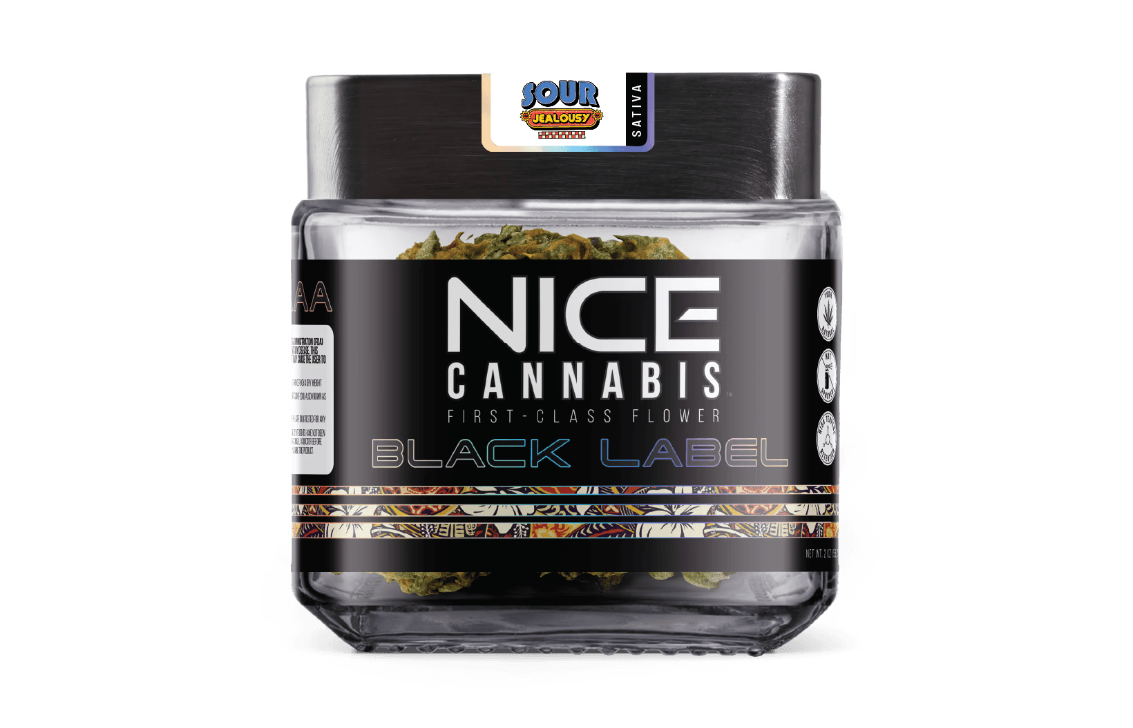
Nice Cannabis needed a recognizable visual identity that could stretch across different products, flavors, campaigns, and formats.
My goal was to create enough consistency that everything felt unmistakably part of the same brand while still leaving room for individual products to have their own character.

System
Building a system that could flex
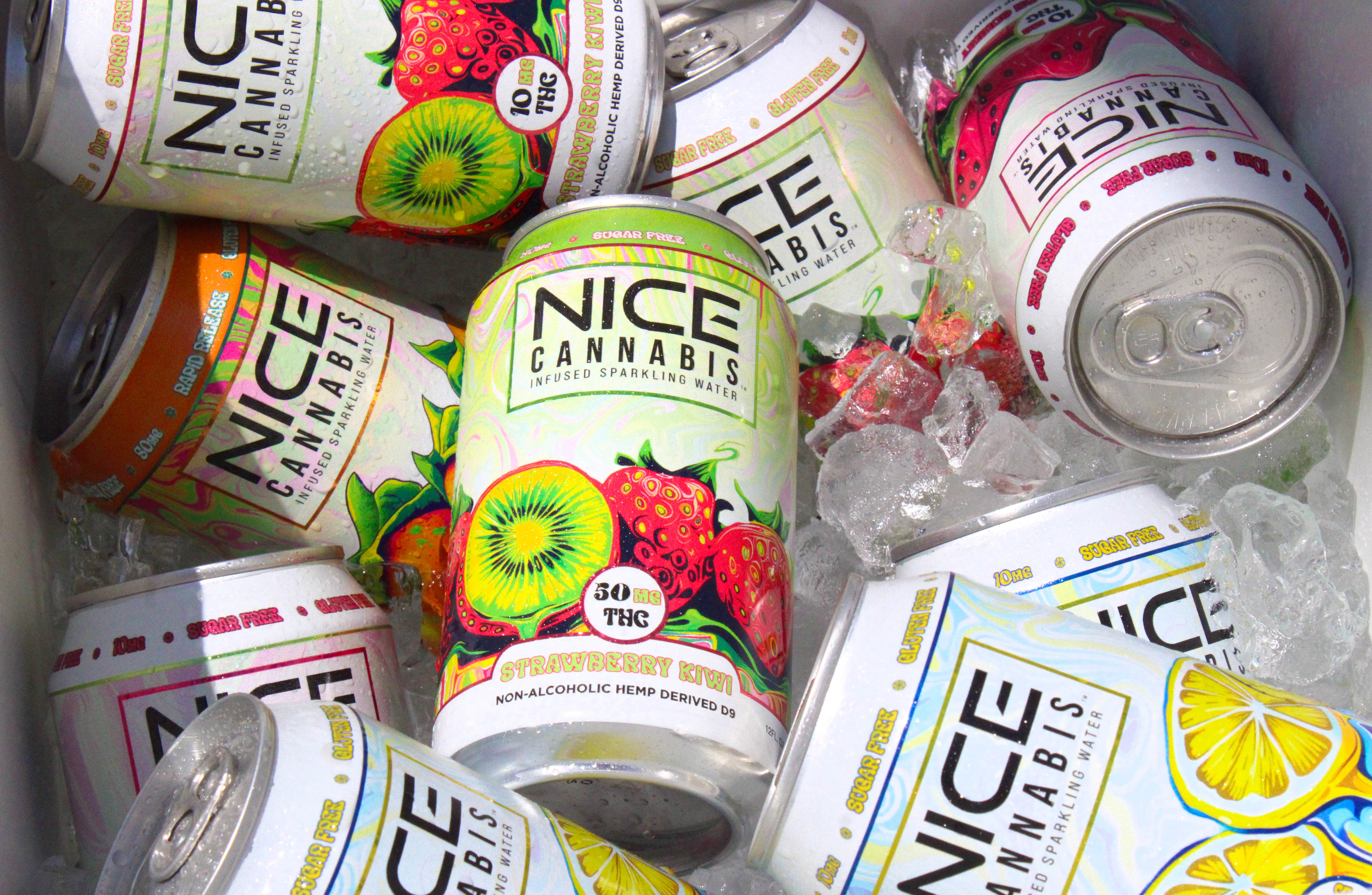
Rather than treating every product as a separate design, I worked from a shared visual foundation.
Consistent typography, logo placement, packaging structure, and brand elements created familiarity, while color, illustration, and supporting graphics gave individual products room to stand apart.
This approach made it easier to introduce new products without rebuilding the visual language each time.
Packaging
Designing for the shelf and the real world
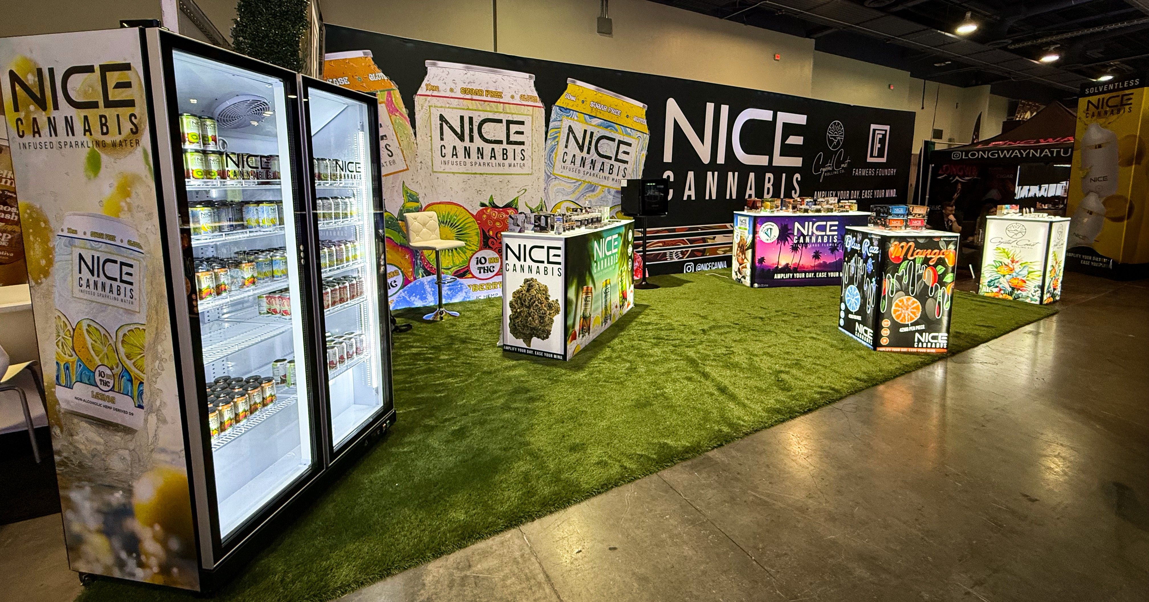
Packaging had to do more than look good on screen. Each design needed to remain recognizable at a small scale, communicate clearly, and work within the constraints of real production.
I balanced bold graphics with consistent hierarchy so product names, flavors, and key information remained easy to find while the packaging still felt expressive.

Photography
Giving the brand a world beyond the packaging
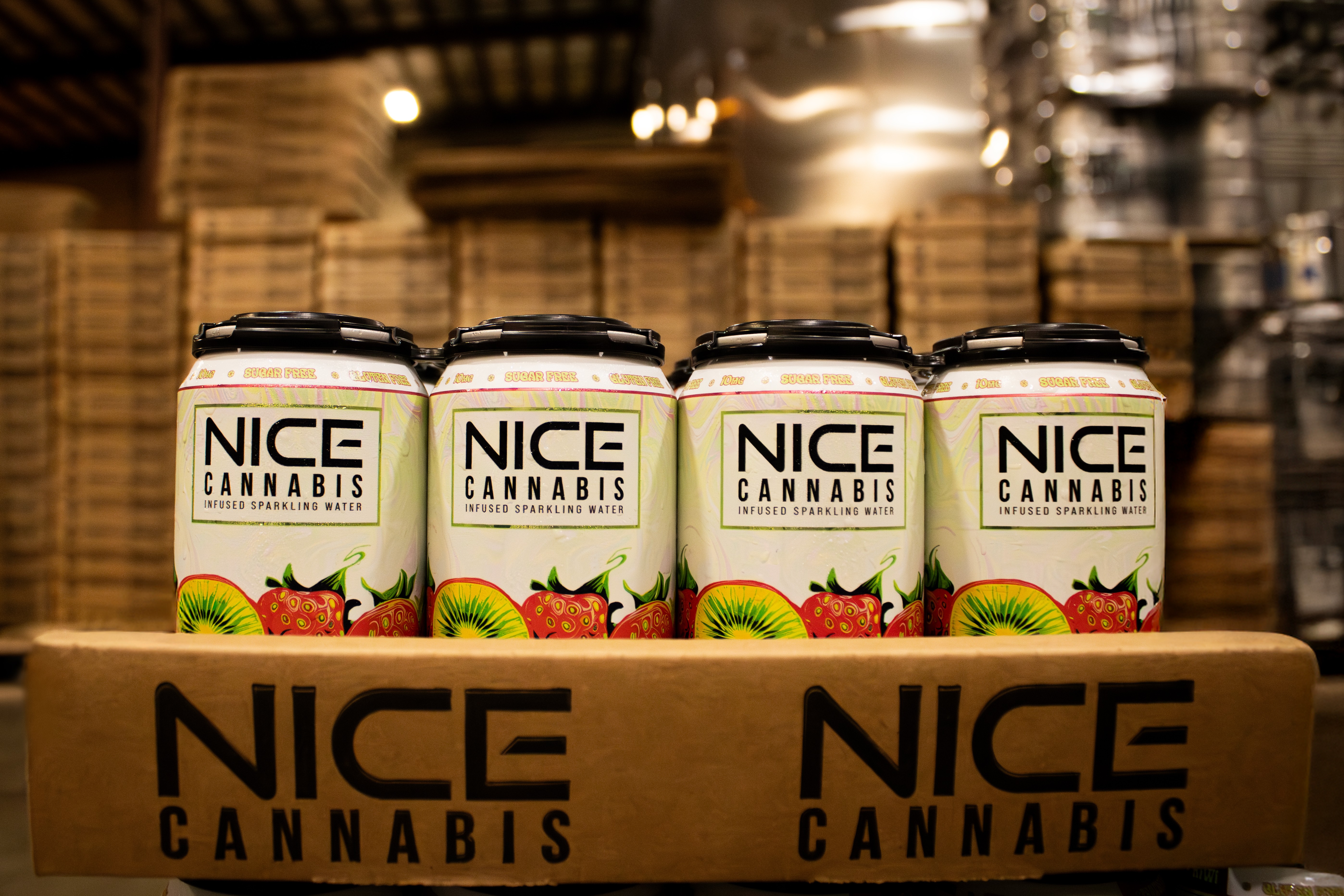
Photography helped establish how the brand felt outside of the product itself.
I created a mix of product, lifestyle, retail, and seasonal imagery that could adapt to different campaigns while still feeling connected to the larger visual identity.


Role
Working across the brand
My role extended beyond creating individual pieces. I worked across several parts of the brand and had to think about how each one connected to the next.
Brand
Maintained and extended a consistent visual language across products and marketing.
Packaging
Designed packaging and product variations while working within production requirements.
Photography
Planned and produced product, lifestyle, and campaign imagery.
Production
Prepared creative work for real-world use across packaging, print, digital, and marketing applications.


