Coinbase
2026
Coinbase Verification Case Study
While going through my own crypto trading, I kept hitting the same moment of hesitation during identity verification: being asked for my SSN, my employer, and my source of funds, with no explanation of why or what would happen to that information. Instead of brushing it off, I looked into why that moment felt different from the rest of the form. What I found led me to rethink how the verification screen builds trust — not by asking for less, but by explaining more, and only where it actually matters.

Overview
Sensitive and routine information looked exactly the same
Sensitive and routine information looked exactly the same.
At first, the issue seemed straightforward: verification asks for a lot of personal information.
But the more I looked at the actual screens, the clearer it became that the problem was not the amount being asked for. It was that the form gave no indication of why. Low-stakes fields like name and address and high-stakes fields like SSN and source of funds sat side by side, styled identically, with the same silence around both.
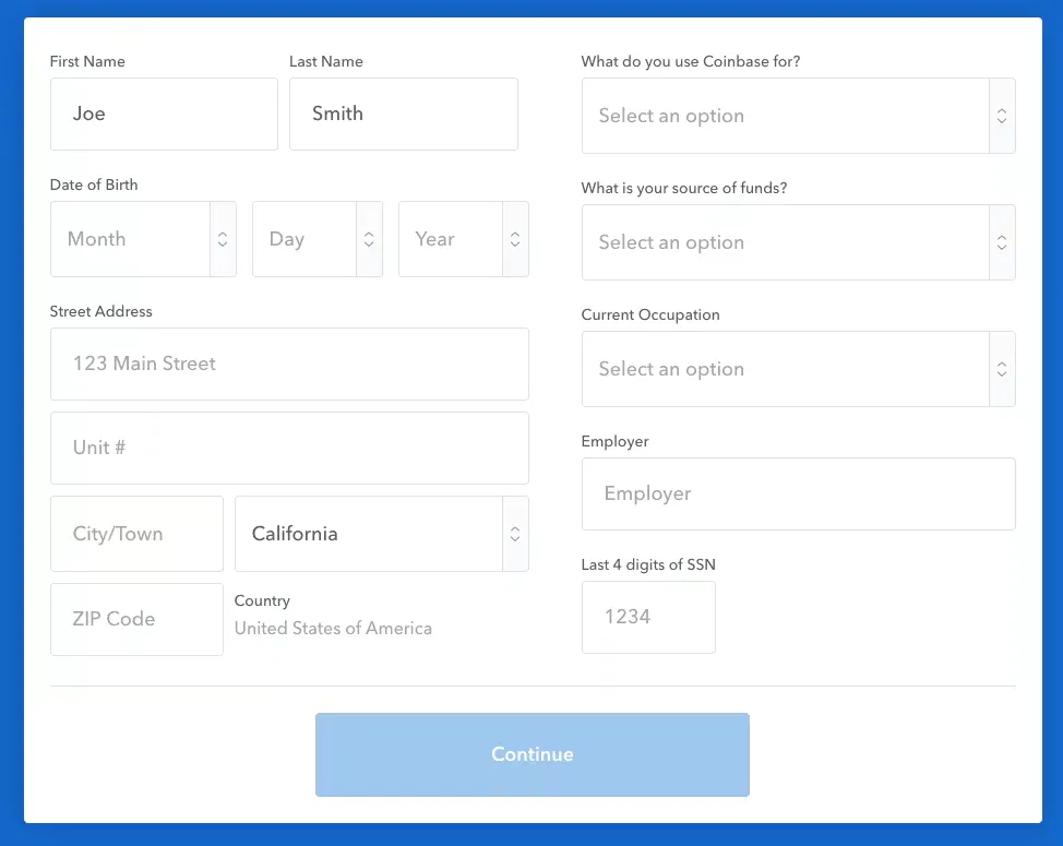
A field asking for a unit number looks identical to a field asking for the last four digits of a Social Security number. Nothing on the screen signals which questions are routine and which ones deserve a pause.
Research
I tracked my own verification experience against the flow itself
Rather than assuming where the friction was, I went through Coinbase's actual verification steps and paid attention to where I hesitated, and why. A separate regional version of the same flow, which breaks these questions into individual screens with contextual reassurance, gave me a useful comparison point.
The personal information step — name, address, financial details, SSN — was the one moment that gave me real pause, even though I had been through it before. Everything else in the flow felt mechanical and clear; this step asked for the most sensitive information with the least explanation.
This kind of hesitation is not unique to my experience. Industry research on crypto onboarding shows that verification is where the steepest user drop-off happens across the category — though that data reflects crypto platforms broadly, not Coinbase specifically.
Key Insight
Coinbase's consent design doesn't scale with the sensitivity of the data being asked for.
Low-stakes fields get little explanation because they do not need much. High-stakes fields — SSN, source of funds, employer — get exactly the same treatment, even though they are the ones that are most likely to make someone pause.
That changed the question I was trying to answer.
Instead of asking:
How do I reduce the amount of information being requested?
I started asking:
How can the form explain itself only where the stakes are high enough to warrant it?
Exploration
Designing around trust, not just information
I explored a few ways to close the gap between what the form asks for and how much context it gives.
Modal-per-field
My first instinct was a popup explaining each sensitive field individually. I moved away from this quickly — a modal interrupts the form and reads as a warning, not a reassurance, adding friction even for someone who wouldn't have hesitated in the first place.
Inline, sensitivity-scaled context
The stronger direction was to leave the form's structure untouched and add a short line of context directly beneath only the fields that actually cause hesitation.
Low-stakes fields stay exactly as they are. High-stakes fields get a quiet, specific explanation of why the data is needed and what it isn't used for, placed exactly where the doubt would occur.

The comparison makes the problem visible on its own: nothing in the original form distinguishes a unit number from a Social Security number. The redesigned version does not add friction — it adds context, and only where it is earned.
I worked through the copy before polishing the UI
Before finalizing the visual treatment, I tested a few ways that the reassurance text itself could look — plain text, an icon paired with text, and a tinted field background.
I chose plain text with no icon or added visual weight. An icon risked introducing a security cue that was not there before, and a tinted field made the sensitive input stand out more, not less — both worked against the goal of reducing hesitation rather than drawing attention to it.
Solution
A form that explains itself only where it needs to
The final concept keeps Coinbase's existing verification form almost entirely intact. Field order, layout, and low-stakes fields are untouched.

The only change is a short, specific line of context beneath the three fields most likely to cause hesitation — employer, source of funds, and SSN — explaining what the data is for and what it is not used for.

Each line follows the same shape: why the information is needed, and what it is specifically not used for. That second half does most of the work, addressing the unstated fear behind the question rather than just justifying the ask — the goal is not to make verification feel lighter, it is to make it feel reasonable.
Reflection
The answer was explaining more, and only where it counted.
I started this project thinking the problem was how much information verification asks for. The research pointed to something narrower: the information itself was reasonable, but nothing signaled that the platform understood some of it felt different to ask for. That shifted the project from a data-minimization exercise to a trust-design exercise.
Next Steps
Because this was an independent concept, usability testing would be the next step before development. I would test whether users report less hesitation at the SSN and source-of-funds fields specifically, and whether the form still completes at the same speed as the original.
If implemented, I would track verification abandonment rate at this step, and support contact volume tied to "why do you need this" questions.
Reducing friction does not always mean asking for less. Sometimes it means explaining the ask, and only where the stakes are high enough to deserve it.

